Attach first
AI brand context, download MD
Voice, logo, colour, type, icons, imagery and photography, with the image and icon prompts.
Contega brand system · V1.1
Who we are
Senior, intelligent and contemporary.
Never traditional.
What that means in practice
We are senior in experience, boutique in attention and modern in how we work. We listen closely, use data intelligently and turn complexity into clear, practical advice.
How we show up
These traits guide the way Contega behaves, communicates and advises.
Foundation
We listen closely, question carefully and build a clear picture before recommending a way forward.
One approach, four stages
The same four stages everywhere, told at three depths: one line each on the homepage, each stage expanded on How we work, and the stage name above a sector headline on solutions pages. Stay alongside uses the Partnership shield icon.
We get to know your business in depth, and what it relies on.
We examine the risks and work through what they mean for you.
We recommend a way forward and arrange insurance shaped around what matters.
We stay close through claims and renewals, and adjust the program as your business changes.
Identity
The letter C and a shield come together as one resolved mark: protection through partnership. The shield and the contega wordmark always share one colour in the standard logo.
Authoritative. Modern. Distinctive.
Pronounced con-TEG-a Hard “g”, with emphasis on “TEG”.
Primary logo
The preferred signature for most brand and digital applications. The shield and the contega wordmark share one colour: Clay. Use it on light and dark backgrounds, and Clay on Coffee when the logo needs to be contained.

Risk Advisory lock-up
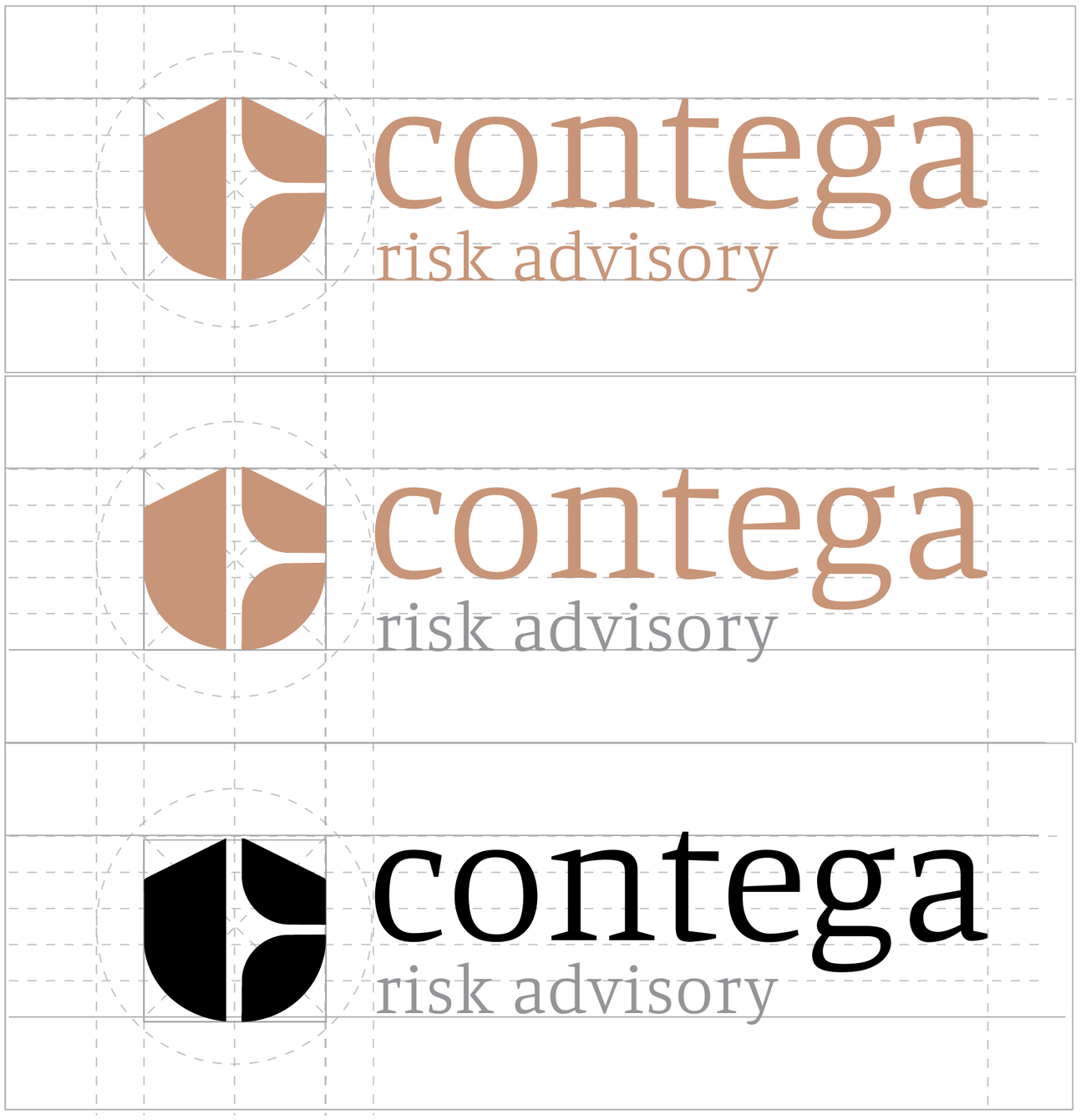
The secondary signature, for when the audience needs Contega’s service made explicit. The two-tone version, with “risk advisory” in Blue Grey, is the preferred expression wherever the descriptor stays clear: on light backgrounds at header size and larger, and at large sizes on dark. Otherwise use a one-colour version.

Standalone shield
The most compact signature. Use it alone where the brand is already identifiable, or where the format calls for a compact mark: favicons, social avatars, app icons and profile images. Black and white are for single-colour reproduction; the square and circle contain the shield for avatars, tiles and social profiles. It can also be enlarged as a graphic device: in one colour, in three colours as on the capability statement covers, or as a tonal shield behind a Clay statement band (Brick at 13%, capped at the homepage size; text over it is large text only).




Approved colour pairings
Secondary applications. Each pairing is made for one background colour from the palette: use it only on that background, and only when the Clay logo is not the better choice. They are not alternative primary logos.
Clay on Coffee
Coffee backgrounds. Also the contained version of the primary logo.
Clay on Brick
Brick backgrounds and warm feature panels.
Warm Charcoal on Clay
Clay backgrounds, such as Clay bands on the web.
Warm Charcoal on Blue Grey
Blue Grey backgrounds.
Clay on Steel
Steel backgrounds, such as product and dashboard covers.
Clay on Olive
Olive backgrounds.
Clay on Warm Charcoal
Warm Charcoal backgrounds.
Brick on Stone
Stone backgrounds and printed stock in a similar tone.
Brick on Silver
Silver backgrounds.
Shield pairings for avatars, tiles and app icons, supplied as squares and circles.
 Clay on Coffee
 Clay on Brick
 Clay on Steel
 Warm Charcoal on Clay
Clear space
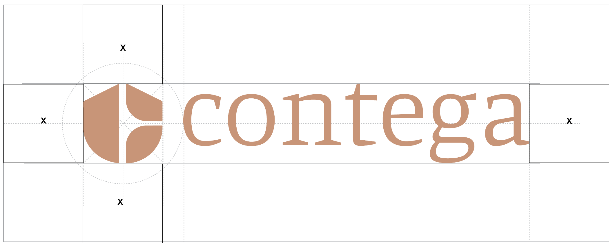
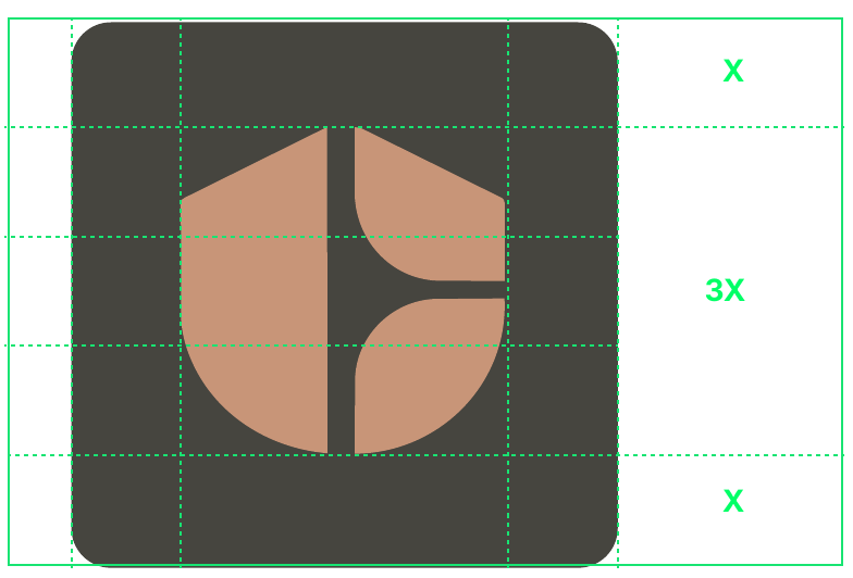
Keep a minimum clear space of X around the logo, where X is the size of the shield. Keep the area free from text, graphics and edges. The same rule applies to the Risk Advisory lock-up. For the contained shield, keep X on every side of a 3X shield.
Choosing a logo
There is no single minimum size. Choose the version by how far away it is read and how much room it has: step down from the lock-up to the wordmark when “risk advisory” stops reading comfortably, and to the shield only when Contega is already clear.
Website header
Mobile screen
Email signature
Your name
Your role
+61 X XXX XXX XXX
you@contega.com.au
contega.com.au
Part of the Cohabit Group, a risk intelligence company.
Confidentiality and privilege notice.
Large format
Group endorsement
Contega is part of the Cohabit Group. The endorsement tells clients who stands behind Contega without competing with the Contega identity. Contega always leads; the Cohabit Group follows, in one of two approved forms.
Endorsement line
Part of the Cohabit Group, a risk intelligence company.
Group band

A Cohabit Group company
Contega is the commercial risk advisory business within the Cohabit Group, a risk intelligence company built around clearer data, better decisions and smarter insurance outcomes.
Visit cohabit.com.au
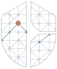
Brand iconography
Market analysis
Risk review · Cyber risk
Liability
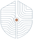
Stay alongside · Connect
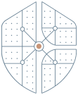
Cyber risk

Claims support

Respond · Business interruption

Visibility · Confidence

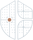
How to use shield icons
These rules keep the set distinctive. Where a layout needs many icons, small icons or interface controls, use the functional icons in the UI system instead.
Extending the set
First check whether an existing icon already carries the idea. If a new concept needs its own icon, start from this prompt with the shield icon artwork as the reference, then review the draft against the set for silhouette, central point, line weight and level of detail before it is added.
Download the shield icon setOne concept, or two closely related ones. For example: supply chain risk.
Prompt
Using the supplied Contega Shield Icon as the exact structural reference, create an icon representing [CONCEPT]. Maintain the existing shield silhouette and central circular point. Use simple, precise linework derived from the shield geometry. Keep the design minimal, abstract and architectural, with a similar level of detail and visual weight to the existing icon set. Avoid literal symbols, pictograms, text, charts or unnecessary detail. The finished icon should feel intelligent, technical and consistent with the Contega identity.
A starting point for a draft, not an approved icon.
Colour
Primary palette
Start here. Clay carries the identity, Brick adds depth, Coral is the single accent, and Dark Charcoal and Light Silver are the canvases most pieces sit on.
Extended palette
Supporting tones for environments, product surfaces, data and reports. Reach for them after the primary palette is in place. Larger blocks carry more of a layout; smaller blocks are accents within a family.
Blue greys
Green greys
Brown greys
Typography
A clearer view of risk changes the conversation.
Aa Bb Cc Dd Ee Ff Gg 0123456789
We listen closely, question carefully and build a clear picture before recommending a way forward.
ABCDEFGHIJKLMNOPQRSTUVWXYZ
abcdefghijklmnopqrstuvwxyz · 0123456789
Commercial risk, clearly understood.
Better visibility. Smarter decisions.
The people behind the advice
Plain language that respects the reader's intelligence.
OBSERVE · ANALYSE · PROTECT
Brand imagery
Shield images
Photography contained within the shield, combining people, places or detail, or the shield as a fine outline. Use selectively, for strong and recognisable brand moments.
Framed images
Photography within a rectangular frame that carries the curves and geometry of the shield. Suited to larger imagery and content-led layouts, in portrait or landscape.
Changing the imagery
These are patterns, not fixed artworks. The same rules apply in Figma and code (BrandImage and ShieldOutline).
Photography
Advice in action
Conversation, listening and working through a problem together.



Clients and their worlds
The people, places and movement of the businesses we protect.



Technology and intelligence
Data and tools used in context, by people, not as abstract screens.



Structure and detail
Architecture, materials and light that support the story, never the only subject.



Favour
Avoid
How to use it
The prompt is a starting point for art direction. A generated image is not approved until it has been reviewed.
For example: a site manager and adviser walking a warehouse floor, early morning light.
Prompt
Using the supplied Contega photography as a visual reference, create a natural, editorial-style image for a contemporary commercial risk advisory brand. Photography should feel observational, intelligent and grounded in the real world, never staged or overly corporate. Capture candid moments, natural movement, considered architectural details or technology being used in context. Use warm neutral tones, natural light, soft reflections, subtle foreground blur and occasional motion blur to create depth. Keep the colour treatment restrained, with warm amber and cream tones balanced by charcoal, slate and cooler neutrals. Avoid strong orange or yellow colour casts. Composition should feel sophisticated and slightly unexpected, using interesting crops, negative space, foreground elements or architectural framing. People should feel unaware of the camera and should not pose or look directly at it. Avoid generic corporate stock photography, handshakes, posed boardroom meetings, exaggerated expressions, overly polished offices or obvious insurance imagery. Subject: [Describe the required scene, environment, people, technology or architectural detail.]
Voice
Avoid
Leveraging innovative solutions to optimise your risk management outcomes.
Prefer
We help you see your risks clearly, then build protection around what matters most.
UI system
Generous space, decisive hierarchy and restrained interaction. Product surfaces can use the broader palette while keeping information clear and the interface calm.
Browse the working design system for tokens, components and patterns.
Explore the design systemActions
Advisory card
Property risk
A clearer picture of assets, exposure and obligations.
Information
Note: Considered advice
Functional icons
Shield icons
Motion
Considered movement. Every movement reveals, orients or confirms, using the motion tokens. Brand moments play once as they arrive; interface feedback is quick and quiet. Replay each example below.
We listen closely, question carefully and build a clear picture before recommending a way forward.
We get to know your business in depth, and what it relies on.
We examine the risks and work through what they mean for you.
We recommend a way forward and arrange insurance shaped around what matters.
We stay close through claims and renewals, and adjust the program as your business changes.
Advice shaped to the organisation.
Advice shaped to the organisation.
Advice shaped to the organisation.
Working with AI
Attach first
Voice, logo, colour, type, icons, imagery and photography, with the image and icon prompts.
Attach second
Understand the need, test the format, sharpen the brief, then make it Contega.
How to use it
For example: a slideshow from these notes to introduce Contega to a prospective client.
Prompt
You are helping shape and create work for Contega. Read both attached guides: use the brand context as the visual and verbal foundation, and follow the briefing guide to investigate the need before production. My request: [what I think I need] Source material: [content, links, data or files] Audience and context, if known: [who and where] Before making it, identify the business need and the change this work should create for its audience. Assess whether the format I've requested is the best fit. If there is a materially better option, recommend it briefly and explain why; otherwise proceed with my format. Ask only questions that would change the direction or quality of the result. When there is enough context, state your assumptions, sharpen the brief and start the work. Ground factual claims in the supplied material or cited sources. Keep the output recognisably Contega, and flag genuine gaps in the design system.
Fill in the source material and audience in your AI tool. The output is a draft until reviewed.
By task
The format decides which parts of the system to use.
Resources
Logos
The primary logo, Risk Advisory lock-up, shield and approved colour pairings in SVG, PNG and JPG, with the master artwork, logo guidelines and a quick reference, plus the Cohabit Group endorsement logos.
Typography
Manuale and Inter variable fonts for offline and print work, the font guidelines and licence notes. On the web, load both from Google Fonts.
Iconography
The twelve V1 shield icons as SVG, for presentations, reports and web content.
Colour
The primary and extended palette with type, spacing, radius and motion values, for digital products and Figma.
The editable HTML signature template, with the Cohabit Group endorsement line, and its logo asset.
Design system
Work-in-progress Storybook: tokens, components, patterns and templates for digital products.
AI
Attach to any AI tool with the briefing guide: voice, logo, colour, type, icons, imagery and photography, with the image and icon prompts.
AI
How an AI collaborator should understand the need, test the format and make the work Contega.